TransferWise CMS refresh
I initiated and led a project to share exciting, engaging messages with potential customers by separating the frontend and backend of TransferWise’s marketing CMS. This made it easier for developers to contribute new widgets and improved the editor's experience, as well as freshened up the design of landing pages with the latest from the company design system.

Context
The custom in-house marketing CMS at TransferWise, Lienzo, made it difficult to share exciting, engaging messages with potential customers.
It was originally created to quickly scaffold landing pages for SEO experiments, but had expanded its scope over time to be used by the digital ads team, product managers, legal, and more. These new users had a different set of requirements, and the CMS fell short in a few places:
- It was difficult for developers, especially outside the CMS team, to add new features to spruce up marketing pages. The custom frontend did not follow modern best practices used across the rest of the company.
- The editor’s experience was unintuitive, which made it difficult for newcomers to use. Page editors could not preview changes before publishing them so they had to know exactly what they wanted to do. It could not server-side render React components, so pages created with Lienzo could not easily integrate common UI components shared across the company in an SEO-friendly way.

Outcomes
Next.js frontend for a headless CMS
We leveraged the CMS' existing API, used by the SEO team for editing pages in bulk. This made it possible to quickly prototype a proof of concept with Next.js.
How it works (core application flow): When the user requests a URL, the Next.js app asks the API if a page exists at that route. If the page exists, the API returns the list of "widgets" configured to display on that page. A Heading widget might have a title, image and call-to-action link. Widgets are mapped into React components, dynamically importing only the necessary ones to render the page.
This gave us a Server-Side Rendering pipeline for React, which improved the general design of all the pages—the company design system had migrated to React, and it was difficult to keep Lienzo's custom frontend setup up to date. Switching to Next.js also made it possible to use several other tools and libraries shared by frontend apps across the company.
Developers describe contributing as "a pleasure to work with"
The new frontend lowered the barrier of entry for TransferWise developers to add complex, custom widgets to pages created with Lienzo.
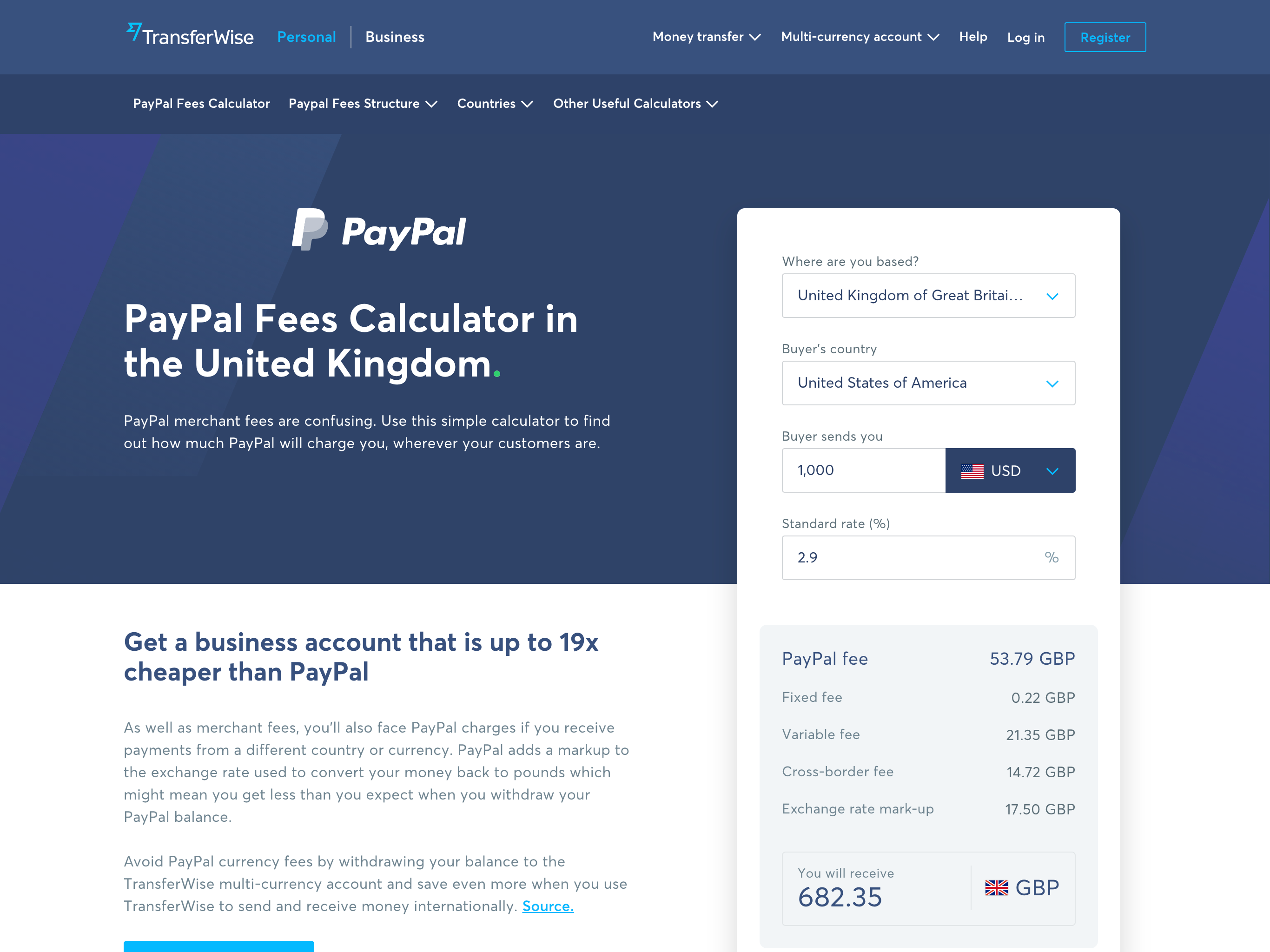
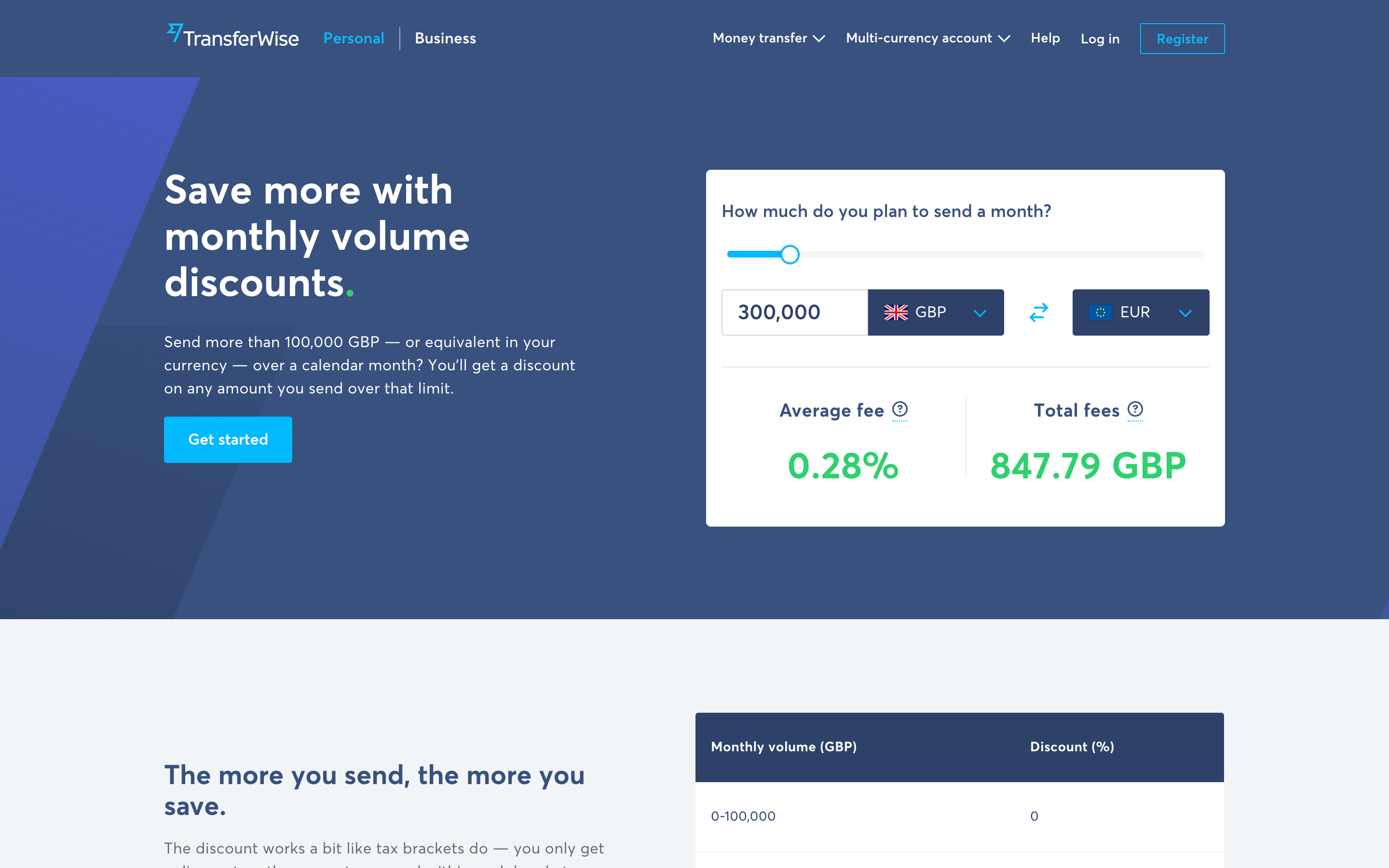
Example: The High Amount Transfers team launched a new volume-based discount feature, and designed an interactive slider so customers could explore how much they would save. They wanted to showcase this component on a marketing page, but on the old Lienzo frontend pages were limited to existing widgets. Before we introduced them to the new frontend, the developers had planned to make a new Next.js app and recreate several widgets already existing in Lienzo just for this page.

Instead, they used the CMS to manage 90% of the landing page with existing widgets. This gave their engineers time to focus on the key feature, with none of the long term maintenance responsibilities of creating a new app.
The JavaScript codebase keeps bespoke code isolated and makes the dependency chain more explicit, which will keep the codebase healthy over the long term. The legacy frontend used a traditional setup of CSS classes in template files to trigger JS behaviour defined elsewhere in the codebase, which led to difficulty troubleshooting complex issues.
Conventions for widget-building were well-documented, and were designed for developers to fall into the pit of success.
Editors build pages with a live preview
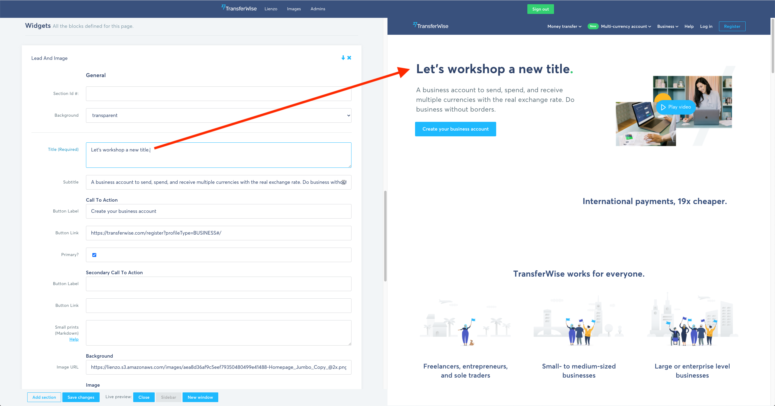
Another challenge to storytelling on Lienzo was the editors' experience. The "edit page" view was a series of text inputs and select boxes, and without a revision or draft system the editor had to mentally visualise the changes they were making, then publish blindly. There was a limited preview system which only worked for new, pre-published pages. Once the page was live, the editor had to know which widget they wanted to add based on its name.

To solve this, I created a /preview route in Next.js and embedded it in the edit view as an iframe. When content or config changed in the edit view, it would push new data into the preview pane with the postMessage() API, rendering the page as the editor works on it. The result was a fluid experience that allowed editors to experiment and design in a more intuitive way.